Google’s Data Studio - connect your BigQuery table for always up-to-date visuals
Useful links:
In order to display our data as below, here are the steps to follow:

Export the table to Data Studio
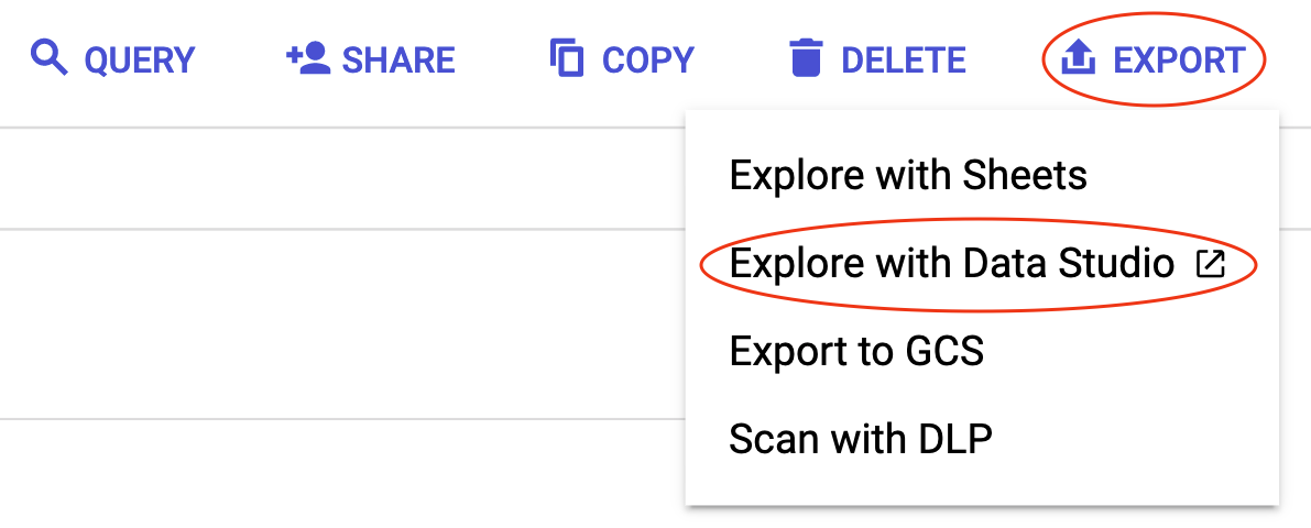
In the BigQuery console, with the table to export open, click on EXPORT at the top right, then on Explore with Data Studio. A new tab will open and a big table will be displayed directly in Data Studio.

Create the Data Studio chart
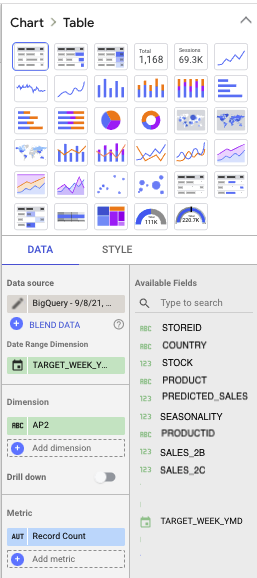
The pannel on the right of the window should look like this:

Let’s start by choosing a chart type. The one used above is a combo chart.
The table tranforms to a combo chart, but now we need to adapt the fields to how we want them displayed:
TARGET_WEEK_YMDas Date Range Dimension as well as Dimension: the format should be a YMD format recognized as a date by Data Studio.PREDICTED_SALESandSALES_2Cas Metric: they should bu a sum type of aggregation.TARGET_WEEK_YMDas Sort: so the data is displayed in ascending order.
Add an interactive filter to let viewers interact with the data
Now, to set up the interactive filter on the left of the chart, at the bottom of the pannel on the right, under Interactions, select “Enable sorting”. In the menu bar of the window, by clicking on “Add a control”, a button to insert a fixed size list will appear.
After adding it, we select it and set it up in a similar panel to the one displayed when configuring the chart. Date range dimension stays the same, but in order to control the type of product we want to show sales for, the control field must be changed to Product group . The metric should be like in the chart, sum of predicted sales, and that’s it.
Now that the chart is finished, we can click on VIEW at the top right of the screen, and play with the interactive filter, to see only data selected on it. The people this page has been shared with will be able to also play with the filter.
That’s it!
We now are able to make predictions and show them off on a neat Data Studio page.
